
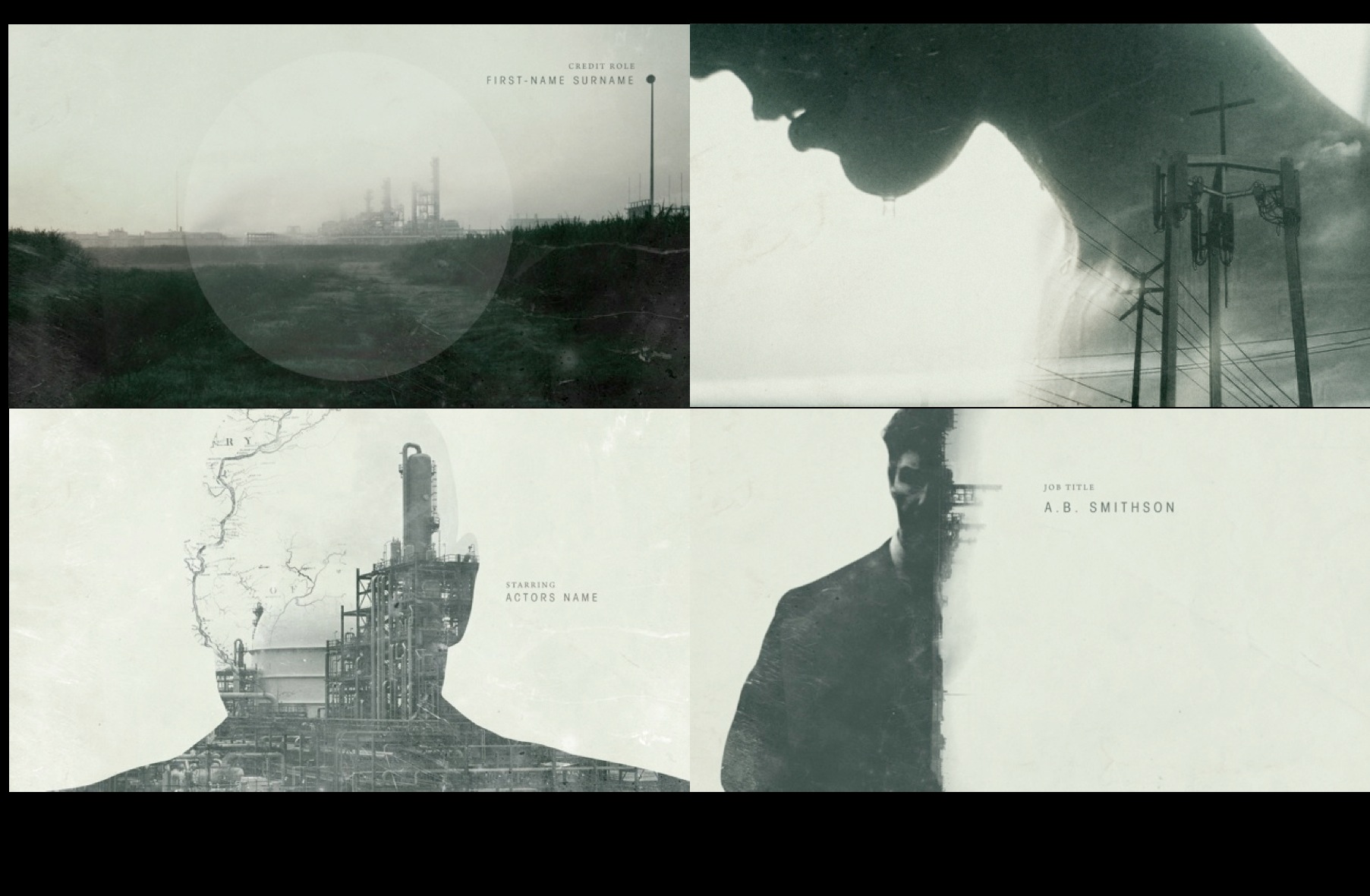
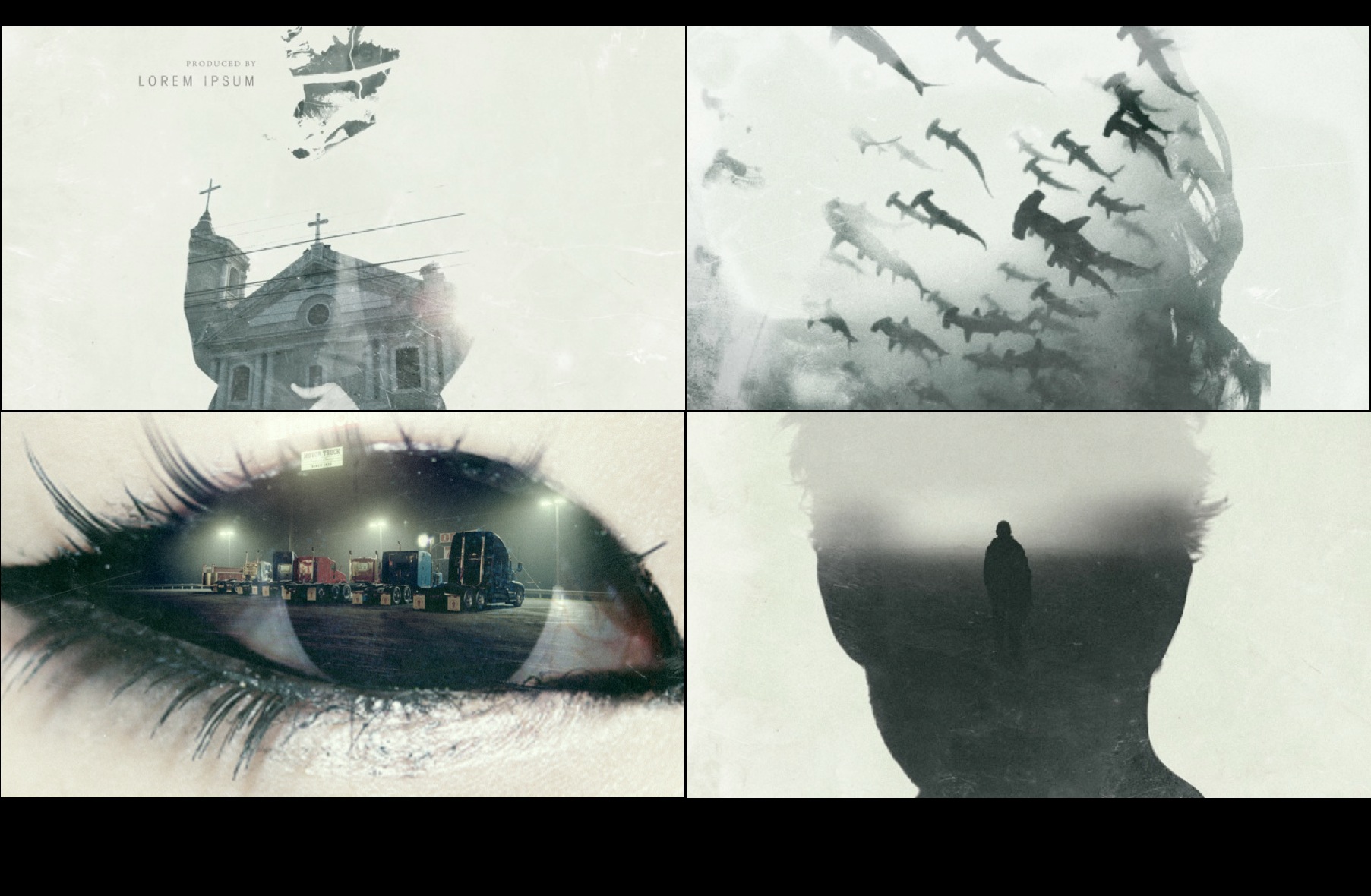
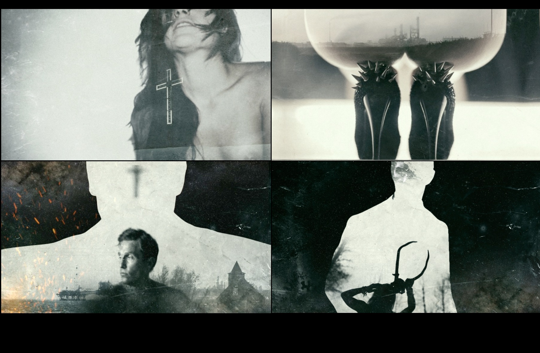
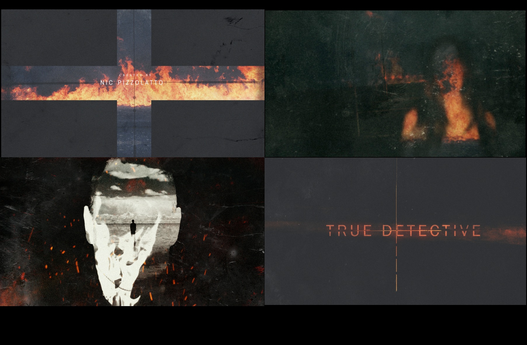
HBO's latest offering to the gritty, TV drama space has come in the form of True Detective. A bleak, desaturated detective show set in the wastelands of Louisiana. Like most HBO shows, there is an extraordinary level of detail to the world. The minutia of life in small town USA, 1995, is clear to see; from the drab, rain drenched clothing, to the blurred and browned crime scene images. This is a world with little hope but plenty of faith.
Strangely, the minutia of any project can say an incredible amount about a world. Whether it is the title font of the credits, or the colour palette of title images, these small touches are what reinforce theme. The title sequence to True Detective echoes the same ideas as the show. They frame the world in steel petrol plants and silhouettes of strippers, with dark skylines and broken figures. It places you in that world and allows you to settle into the grime of a place that may be so distant. This detail is something so often forgotten or overlooked, but it is hugely important to world building. You set your audience up to engage, to focus them and set their mood. Without this level of detail, you are telling your audience that you don't really care that much.
I have blogged about Art of the Title before. They are an incredible source of knowledge and reference, detailing the art that is so often forgotten. To find out more about True Detective's title sequence, check out this link
You'll find plenty of images and notes on how the title sequence came about, as well as plenty of preproduction pages. So, in short, not only should you watch True Detective, but you should also start paying attention to the details. Think about minutia in your project, in every aspect. Whether it is the typography of your blog, or the colour of your presentation pages. Make sure you care about the small things that often get cut when deadlines run close. These are the details that show you care about your work.
Comments
Post a Comment